A super bright future for women’s football
A look at the Women’s World Cup 2023 logo and branding.
Author
Alice Banham
Date
14.07.2022


As a female footballer who loves all things colourful and creative, – you can imagine my pure joy at the recent reveal of the Women’s World Cup 2023 logo and branding.
I’ve always found the visual language of football very … well, masculine. Even in the women’s game. It’s competitive looking and very much focused on the speed. The power. The physicality and force of the game.


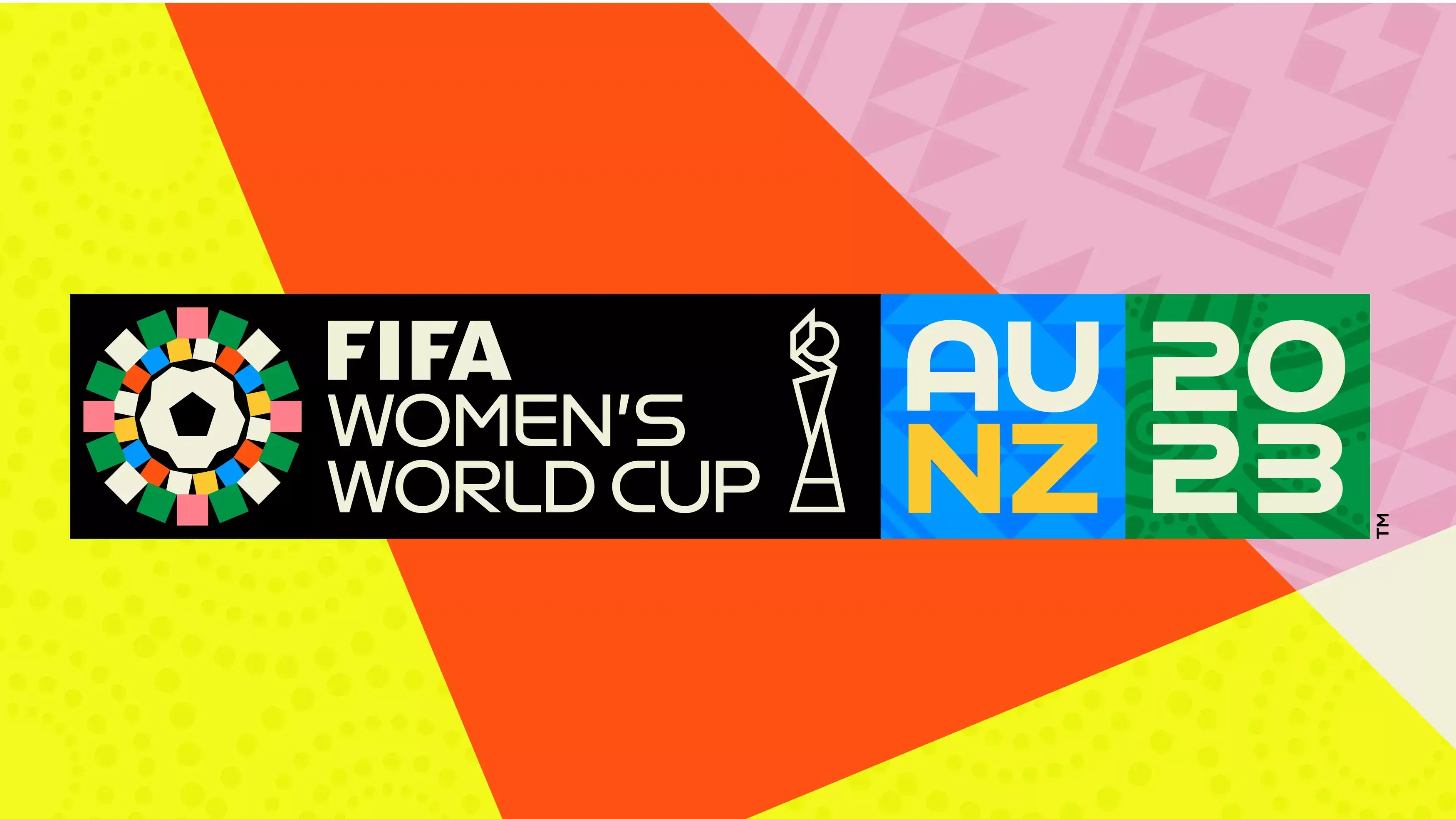
But this is bold in a whole new way. It’s fun. It’s fresh. And it’s still got football at the centre. Quite literally.
There are loads of nice touches. Since the competition will be held in Australia and New Zealand, native female artists were brought in to create patterns that reflect the heritage of their countries. And since 32 national teams will be taking part, 32 squares were included in the logo.
Personally, I love the balance of the various clashing elements. The intricate aboriginal patterns with the bold blocks of overlapping shapes. The retro typeface with the modern cup illustration. And the neon colours with the muted tones mixed in.


This really starts to give the sport its own identity.
It allows us to establish our own world of football that’s vibrant and full of hope – helping us proudly step out from the shadows of the men’s game.